
This blog post explores the nuances of color theory through the lens of the Permanent Green shade from the So Flat acrylic paint series by Golden Paints. Often, we casually talk about colors being “darker” or “lighter,” but understanding the system of hue, tint, tone, and shade deepens our grasp on color dynamics, making explanations clearer and artwork more intentional.
Exploring Permanent Green from Golden Paints
The focal point is the Permanent Green acrylic paint, part of the So Flat collection by Golden Paints. This paint series is notable for its matte finish, which prevents glare and offers a true representation of color. Unlike glossy paints that can reflect light and alter perception, the So Flat acrylics preserve the integrity of each hue’s natural look, making it easier to analyze subtle variations in color.
The coverage and brightness of So Flat paints stand on equal footing with traditional acrylics, ensuring no compromise in vibrancy despite the flat finish. This makes Permanent Green a perfect candidate for dissecting how color interacts with white, black, and gray.|
If you want to see the color exploration in action, check out the video demonstration attached here (original video credit: @bongbenhbay).
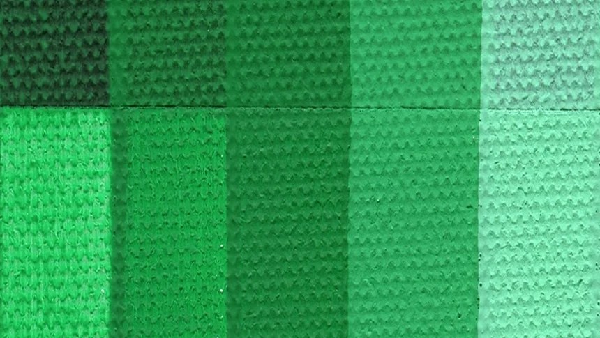
Breaking Down the Color System: Hue, Tint, Tone, and Shade
Understanding color goes beyond simply seeing “lighter” or “darker.” The four terms—hue, tint, tone, and shade—describe specific ways of modifying colors:
- Hue refers to the pure color itself, without any addition of white, black, or gray. It is the base color you start with—the essence of the color’s wavelength. Permanent Green, in its purest form, represents the hue.
- Tint is created when white is added to a hue. This process lightens the color, producing softer and cooler variants. Tinting Permanent Green with white results in a fresh, gentle version ideal for bright, airy compositions.
- Tone involves adding gray (a mixture of black and white) to the original hue. This reduces the color’s saturation and brightness, creating more muted and natural-looking colors. Many artists prefer tones because they evoke subtlety and sophistication; tones of Permanent Green have a quiet elegance that enriches artwork without overwhelming it.
- Shade is achieved by mixing black into the hue, darkening the original color and adding depth. Shades of Permanent Green become richer, more intense, and can convey moodiness or drama.
The Practical Value of Knowing These Distinctions
In everyday conversations, we simplify color discussions as “dark” or “light.” But when explaining color choices or techniques — particularly to students or clients — it becomes essential to use precise terminology. This shared understanding improves communication, reduces confusion, and helps artists and designers create intentional color palettes.
For example, if you want a color to feel calm and natural, you might select a tone. To create a sense of lightness and airiness, a tint is the answer. Need drama or contrast? Use a shade. By mastering these terms, you gain a powerful tool for enhancing your artwork or design projects.
Why So Flat Acrylics Enhance Color Study
The matte surface of the So Flat acrylics is a game changer for color study. Unlike glossy surfaces that can distort color through reflections, the flat finish reveals the “true self” of the paint. You clearly see how Permanent Green adjusts as white, black, or gray is mixed in.
This clarity not only supports better learning but also enables confident decision-making in fine art and design. The paint’s excellent pigmentation and coverage ensure the added colors remain vivid and consistent, maintaining artistic integrity throughout experimentation.
A Personal Impression: Falling for Tones
After working through the different variations of Permanent Green, there’s a personal favorite that emerges — tones. They offer a refined, understated charm with a balanced softness that suits many styles. Tones transform bright colors into something more approachable and nuanced.
This affinity reflects how tones bring a naturalistic quality to artwork, helping colors blend seamlessly, complementing other palette elements without overpowering. It’s a reminder of the beauty found in subtlety — a contrast to the sometimes overwhelming brightness of pure hues or the heavy darkness of shades.
Final Thoughts
Exploring Permanent Green with Golden Paints’ So Flat acrylics is not just about “unboxing” a color; it’s about deepening a fundamental understanding of color theory in practice. By distinguishing hue, tint, tone, and shade, artists gain a more precise vocabulary and a richer toolkit for creative expression.
Whether you’re a painter, designer, or simply a color enthusiast, embracing these color relationships elevates your work and communication. And thanks to well-crafted materials like So Flat acrylics, this journey of color exploration becomes clearer, more reliable, and ultimately more rewarding.

Leave a comment